

RESPONSIVE
WEBSITE DESIGN
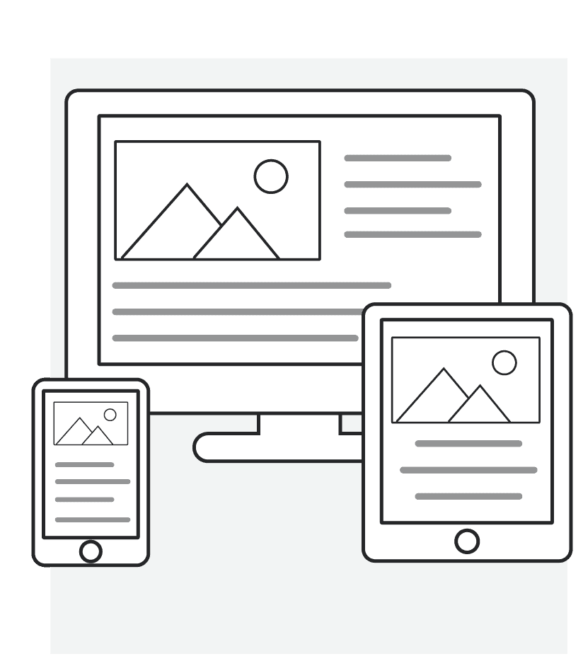
We live in an exciting multi-device digital world. Our connections to content and others are no longer restricted to desktop computers. Instead, desktops are only one of the ways we access information on the web because, the digital device landscape is much more diverse and complicated. There are hundreds of types of phones, tablets, tv/game consoles, and more. Consumers have different screen sizes, resolutions and operating systems.
Let's get started!
Check out our services


Responsive Website Design Considerations
It is no longer effective or efficient to target individual devices. Your application and content must be fluid and capable of being elegantly formatted for the user’s device. Our Denver web designers and developers proactively recognize and adapt to tomorrow’s devices..
Multi-Device World
User Experience Design (UXD) is at the core of all that we build. We have a complete website design process that, if executed well, leads to the creation of excellent user experiences for our customers’ users. In today’s multi-device world this could include mobile website development or responsive website design.
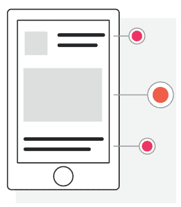
Mobile & Content First
We put mobile and content first at the outset of a project. Our Denver website design team designs your website solely around that. We feel that content is most important and find that starting with less helps us and our client to focus on what matters most. There are many companies that will offer to convert your desktop only website to a “mobile” friendly website. We believe this method leads to nothing less than terrible mobile experiences 99% of the time. A truly responsible multi-device, mobile website design strategy has to start at the beginning with content and the end-user in mind.
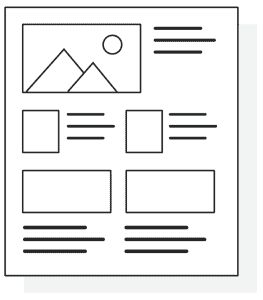
Web Design Wireframes
Think of wireframes like a blue print. At this stage we are not decorating. We are trying to figure out where everything should go. What’s the most important content of the site? Where should that element or content live on the page? Where do we want visitors to go in the site? How are visitors going to move through the site? These are questions that we ask and try to solve during this process.
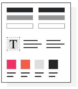
Style Tile/Mood Boards
At this stage we start to identify the look and feel of the visual direction of your site. You can think of this kind of like interior design. We take the notes we have gathered from what have learned about you and your company and create several “Style tiles” or “Mood boards”. Style-tiles are a collection of common elements that will exist on the site like headings, body text, images, and other elements. These help us to communicate the direction the site will go. Interior designers do something similar. We do this because you don’t want to have a whole room designed and then find out, that wasn’t at all the direction you wanted to go. This helps us narrow down the design direction quickly and concisely.
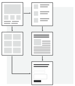
Website Design Prototype
Now for the moment you have all been waiting for! This is the stage where we combine both the wireframes and the style tiles into the completed Design Prototype. However, you don’t see the entire site at this point. We only design the unique pages. On many of the other pages we will have similar elements like a side menu or images or a particular layout. Since these show up multiple times throughout the site there is no need to design every page.